

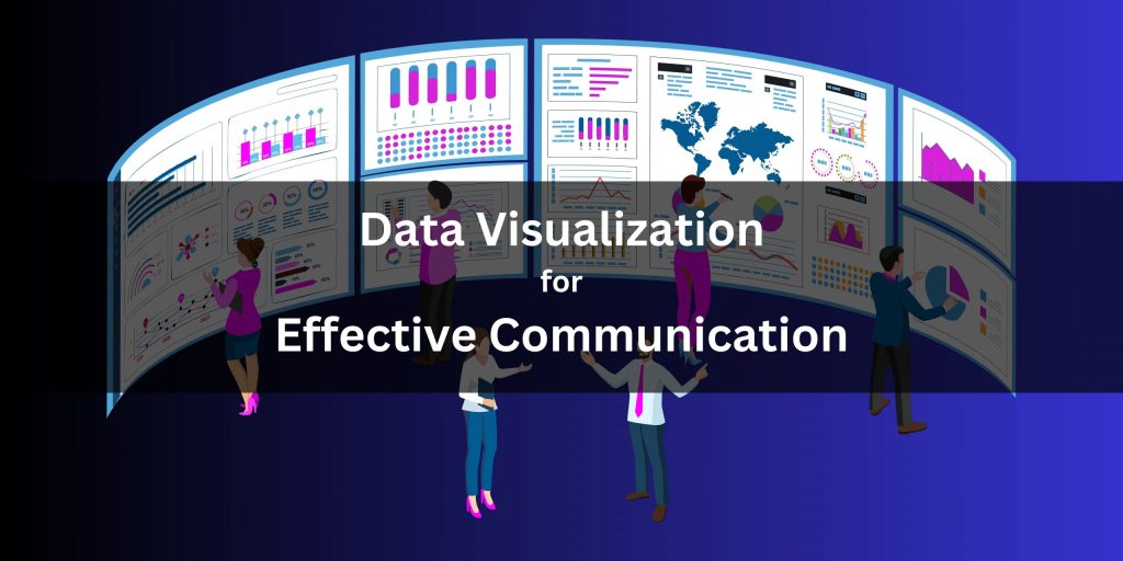
Understanding the Importance of Data Visualization in AI
In the increasingly complex realm of Artificial Intelligence (AI), the challenge of interpreting results effectively cannot be understated. Rich datasets generated by machine learning models often become intricate puzzles, potentially leading to more confusion than clarity without proper visualization. Data visualization techniques emerge as indispensable tools in this domain, converting raw, unwieldy data into digestible and actionable insights.
Effective data visualization addresses several key aspects:
- Clarity: By presenting data in a streamlined visual format, it simplifies complex information that may otherwise overwhelm the audience. For instance, a bar graph can succinctly show sales performance over various quarters, making trends more immediately apparent.
- Engagement: Visually appealing representations can captivate stakeholders’ attention, transforming mundane data into compelling stories. Infographics that blend visuals with simple yet impactful facts can greatly enhance how data is perceived and understood.
- Decision Making: Data visualizations facilitate data-driven decision-making by presenting intuitive graphics that highlight key insights at a glance. A well-designed pie chart can quickly convey market share distribution, aiding executives in strategic planning.
Choosing the right visualization tools can breathe life into data narratives, exposing latent patterns and trends that risk going unnoticed. For example, a heat map is particularly effective in illustrating a model’s performance across different parameters, providing a visual snapshot that delivers immediate insights. This technique allows analysts to see how changes in one variable impact overall performance, making complex interactions easier to grasp.
Moreover, the necessity for effective visualizations becomes even more pronounced when presenting results to diverse audiences. Different stakeholders have varying levels of expertise and different interests. Technical teams may wish to delve deeper into algorithm performance with decision trees or confusion matrices, while executives may prefer high-level dashboard summaries that showcase overall project success. Tailoring the visualization methods to cater to specific groups can significantly enhance communication effectiveness across the board.
The journey through effective data visualization techniques not only enhances clarity but also imbues purpose in a sea of numbers. As artificial intelligence continues to evolve, harnessing these visual tools becomes ever more crucial. They empower professionals to communicate insights compellingly and understandably, fostering a more informed decision-making process. Join us in delving deeper into this fascinating intersection of data and design, and discover how these techniques can transform your approach to interpreting results.
DISCOVER MORE: Click here to dive deeper
Key Data Visualization Techniques for AI Projects
When it comes to fleshing out the narrative behind the numbers, a variety of powerful data visualization techniques can dramatically improve the understanding of AI project results. The selection of the appropriate visualization method is not merely an aesthetic choice; it profoundly influences how insights are interpreted and acted upon. Here, we delve into several techniques that stand out in their ability to translate complex data into meaningful visual stories.
1. Scatter Plots for Correlation Analysis
Scatter plots are invaluable when analyzing the relationships between two numerical variables. This technique allows data scientists to quickly identify correlations or trends, which can signal important interactions in the data. For instance, evaluating the relationship between marketing spend and sales revenue often reveals whether increased investment correlates with higher returns. This visual representation can enable teams to make informed decisions regarding resource allocation in future campaigns.
2. Histograms for Distribution Overview
Understanding the distribution of a dataset is crucial in machine learning projects, and histograms serve as an excellent tool for this purpose. By visually displaying the frequency of data points within certain ranges, histograms can help identify skewness, outliers, and overall trends in the data distribution. For instance, if an AI algorithm performs better on specific subsets of data, represented clearly through a histogram, teams can better target those areas for improved performance.
3. Decision Trees for Model Interpretability
Decision trees provide a straightforward visual representation of the decision-making process in machine learning models. Each node in a decision tree signifies a decision criterion, and the branches illustrate the potential outcomes based on various conditions. This method demystifies the inner workings of complex algorithms, making it easier for stakeholders to understand the reasoning behind specific predictions. Moreover, it empowers technical teams to refine model parameters based on the insights derived from these visualizations.
4. Dashboards for Comprehensive Insights
In AI projects, particularly those with multiple stakeholders, dashboards serve as centralized hubs for monitoring performance metrics and key performance indicators (KPIs). A well-crafted dashboard can combine multiple visualization techniques, ranging from line graphs tracking performance over time to bar charts comparing different models. This multi-faceted approach not only aids in real-time project tracking but also fosters an environment where stakeholders can draw actionable insights at a glance.
- Real-time Monitoring: Dashboards offer the capability to present real-time data updates, allowing for immediate adjustments in strategy.
- Customization: Tailored visual elements geared toward specific audiences make the insights relevant and engaging.
- Comparative Analysis: Combining various metrics in one view fosters rich discussions about performance outcomes.
The choice of data visualization techniques in AI projects has far-reaching implications, determining not only how results are presented but also how they inspire action. By deploying these tools effectively, professionals can cultivate a deeper understanding of their datasets and, ultimately, drive more informed decisions that enhance project success.
| Visualization Technique | Advantages |
|---|---|
| Interactive Dashboards | Enhanced user engagement allows for real-time data manipulation and a more personalized experience in data interpretation. |
| Heat Maps | Visual clarity in displaying data concentrations, making it easier to identify trends and patterns that inform predictive models. |
| Infographics | Ease of comprehension for complex AI results, allowing stakeholders to efficiently grasp insights without extensive technical knowledge. |
| Bar and Line Graphs | Immediate visual comparison of different data sets to highlight performance metrics and forecast future developments. |
The integration of these data visualization techniques into AI project workflows can vastly improve the accuracy of result interpretation. With tools such as interactive dashboards and heat maps, project teams can visualize data in a way that enhances decision-making and promotes a deeper understanding of the information at hand. As a result, stakeholders are empowered to recognize significant patterns more swiftly, leading to more effective strategies within the AI framework. This interactive and visual approach to data interpretation not only elevates engagement amongst users but also underscores the importance of delivering insights in an accessible format. Each technique plays a crucial role in simplifying complexities that often accompany AI data, making it accessible to a wider audience. The evolution of data visualization continues to shape how we interpret AI results, leading to data-informed decisions and innovative pathways for project success.
DISCOVER MORE: Click here to learn about the latest advances in computer vision
Advanced Visualization Techniques for In-Depth Insight
As the landscape of artificial intelligence continues to evolve, the need for sophisticated data visualization techniques becomes increasingly crucial in effectively interpreting AI project results. Beyond the fundamental visualizations, advanced methods can unveil nuanced insights that allow teams to glean deeper understanding from their data. Below, we explore several advanced visualization techniques that can significantly enhance result interpretation in AI projects.
1. Heatmaps for Pattern Recognition
Heatmaps are an excellent visual tool for identifying patterns and variations in data. By using color gradients to represent data values, heatmaps quickly convey complex information in a visually digestible format. For instance, in a project analyzing user engagement on a website, a heatmap can illustrate areas of high interaction, allowing marketers to optimize content placement effectively. This technique is particularly useful in AI applications where large datasets obscure significant trends, enabling teams to detect anomalies or correlations that may have been overlooked.
2. Box Plots for Statistical Summary
Box plots provide a concise summary of numerical data through median values, quartiles, and potential outliers. This visualization technique can be particularly advantageous when comparing performance across different AI models or features. For example, a box plot can illustrate the accuracy rates of different algorithms across various datasets, quickly highlighting the models that deliver superior performance while pinpointing the cases where they falter. By visually summarizing statistical information, teams can streamline discussions around model evaluation and make data-driven adjustments more effectively.
3. Network Graphs for Relationship Mapping
In AI projects, understanding the relationships and interactions within data points can provide valuable insights. Network graphs excel in visualizing these connections, making them ideal for projects involving complex entities and their interactions, such as social networks or recommendation systems. By representing nodes and edges, network graphs can reveal clusters of behaviors, potential influencers, and the flow of information among different entities. This visualization not only enhances the interpretability of AI results but also aids in identifying strategic opportunities for interventions.
4. Time Series Analysis with Line Graphs
Monitoring changes over time is essential for many AI applications, particularly in financial forecasting, performance analytics, or trend analysis. Line graphs are the hallmark of time series analysis, allowing teams to visualize data points collected at successive intervals. For instance, when tracking the performance of an AI model over a set timeframe, a line graph enables teams to quickly assess seasonal trends and variations in model efficacy, facilitating timely interventions or adjustments. By enabling clear visibility of performance trajectories, these graphs play a critical role in effective project management.
- Engagement Over Time: Line graphs can showcase user interactions with an AI application, helping teams to refine user experience continuously.
- Predictive Insights: Trending analysis can provide foresight into how model performance may evolve, allowing for proactive strategy adjustments.
Delving into these advanced data visualization techniques empowers AI teams to extract meaningful insights from their data, fostering an environment of informed decision-making. As projects become increasingly complex, the ability to visualize results effectively becomes not just an advantage but a necessity. By leveraging these methodologies, organizations can transform raw data into actionable narratives, driving progress and innovation in their AI initiatives.
DIVE DEEPER: Click here to discover the ethical challenges
Conclusion: Empowering AI Insights Through Visualization
In the ever-evolving field of artificial intelligence, the importance of data visualization techniques cannot be overstated. As AI projects become more sophisticated, the capacity to interpret complex results accurately becomes a pivotal factor in successful outcomes. Techniques such as heatmaps, box plots, network graphs, and line graphs not only present data in an accessible manner but also enhance the decision-making process by uncovering hidden patterns, relationships, and trends.
By adopting these advanced visualization tools, AI teams can transform raw data into powerful narratives that drive strategy and operations. For instance, utilizing heatmaps for pattern recognition enables marketers to optimize user engagement strategies effectively, while box plots provide a clear statistical summary for evaluating model performances. Network graphs illuminate relationships among data points that can highlight influencers and clusters in user behavior, and line graphs offer crucial insights over time—essential for proactive management and adjustments.
As organizations navigate an increasingly data-driven landscape, the integration of these visualization techniques will be instrumental in enhancing result interpretation in AI projects. Embracing this methodology not only leads to more informed decision-making but also fuels innovation and competitive advantage. Stakeholders are encouraged to delve deeper into these visualization strategies, as they represent the bridge between complex datasets and actionable insights. Ultimately, the future of AI project success rests heavily on the ability to present and interpret data effectively, making data visualization an essential component of any AI strategy moving forward.